
Overview
A client wanted a live reporting experience that could bring together event data from multiple platforms and display it in a clear, visual way during the event.
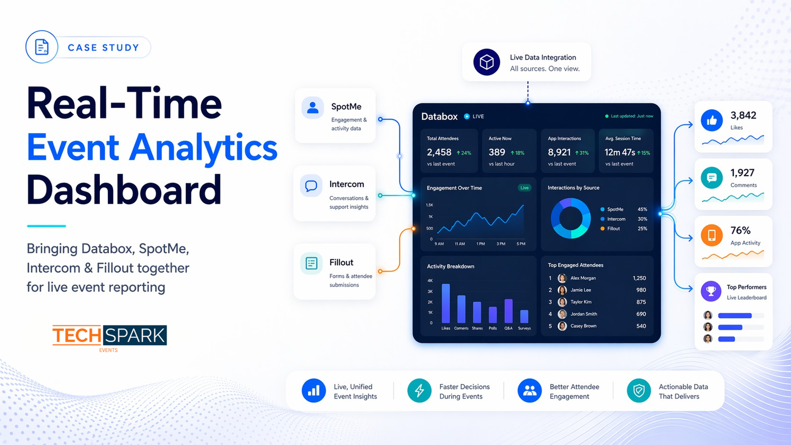
The challenge was that the data was spread across Intercom, SpotMe, and Fillout, and each source had its own structure. The client needed that information to be consolidated, transformed, and presented in a format Databox could use for real-time visual reporting.
Tech Spark Events built a multi-source reporting workflow that pulled data from different systems, reshaped it for Databox, and turned it into dynamic dashboards and screen-ready visual slides with charts, graphs, and live engagement metrics.
The Challenge
The event team wanted a live analytics layer that could show meaningful event activity in a visual format on screen.
They wanted to surface data such as:
- likes on posts
- most commented posts
- highest activity in the app
- leaderboard-style engagement visibility
- other performance and interaction metrics across the event experience
The challenge was that this information did not live in one place.
for engagement and in-app activity
for support and interaction data
for structured submissions and external inputs
The real challenge was not just visualization — it was data preparation, transformation, and orchestration across platforms.
What We Built
Tech Spark Events created a workflow that gathered data from multiple event-related systems, transformed it into the format required for Databox, and enabled dynamic visual reporting.
How the Solution Worked
The solution acted as a reporting bridge between the event tech ecosystem and the display layer.
1. Collecting data from multiple platforms
We gathered reporting inputs from different event systems, each serving a different role in the event experience. This included engagement and activity data from SpotMe, structured response data from Fillout, and additional operational or support-related data from Intercom.
2. Transforming the data for Databox
One of the most important parts of the project was reshaping the source data to fit the format Databox needed in order to display it correctly. This involved preparing the incoming data so it could be turned into clean and usable metrics rather than remaining raw platform output.
3. Creating dynamic visual reporting
Once structured correctly, the data was displayed through Databox as graphs, pie charts, engagement visuals, live metric displays, and dynamic screen-based reporting slides.
4. Surfacing useful event intelligence
This gave the event team and stakeholders a much clearer live view of what was happening across the event environment, including likes, most commented posts, highest activity in the app, and leaderboard-style engagement visibility.
Key Problems Solved
- Brought together fragmented data from multiple systems
- Made event activity easier to understand visually
- Enabled real-time visibility instead of delayed manual reporting
- Transformed platform-specific data into a reporting-friendly format
- Surfaced engagement insights from SpotMe in a more usable way
- Made metrics suitable for live display during the event
Outcome
The result was a dynamic analytics layer that turned multiple event data sources into live visual reporting.
The client gained:
Why This Matters
Many event teams collect valuable data across several platforms, but struggle to bring it together in a way that is useful during the event itself.
This case study shows how Tech Spark Events helps convert fragmented event data into real-time intelligence by connecting sources, preparing the data correctly, and presenting it in a format stakeholders can actually use.
Tools Used
SpotMe
Intercom
Fillout
Need to bring event data from multiple tools into one live reporting view?
Tech Spark Events helps event teams transform fragmented data into real-time dashboards and screen-ready analytics.